
Your girl loves blue. I have painted my bedroom blue many times. It all started with a Pottery Barn magazine when I was 15. I still have the magazine page. Hello Philipsburg Blue!
I most likely will paint a room blue at the Barlow Blue House but I am holding off on painting the walls anything but white until we live there for a little bit and I see how much light the rooms get. I strongly believe in living in a space before making most design decisions.
But back to blue. I want to paint the outside of the house blue – aka Barlow Blue. It’s a color both Alex and I agree on. I thought I wanted a light – green/gray/blue like our current neighbors. But then I started searching and couldn’t pull myself away from a darker blue, which Alex prefers.
Picking the right blue
Here are the colors started looking at:
These don’t necessarily do the actual paint swatches justice but I am looking for a blue with a gray/cool undertone. I don’t want something with a purple or green undertone. I was drawn to the Benjamin Moore Historical Collection. Hale Navy was super popular when I was searching exterior colors online. But I am afraid it is a little too dark and saturated.
My next step: I cut out all the paint swatches and taped them to a piece of white paper. And kept marking underneath the swatch which one I liked. I also realized I should be looking at these colors outside if it’s going to be an exterior color…
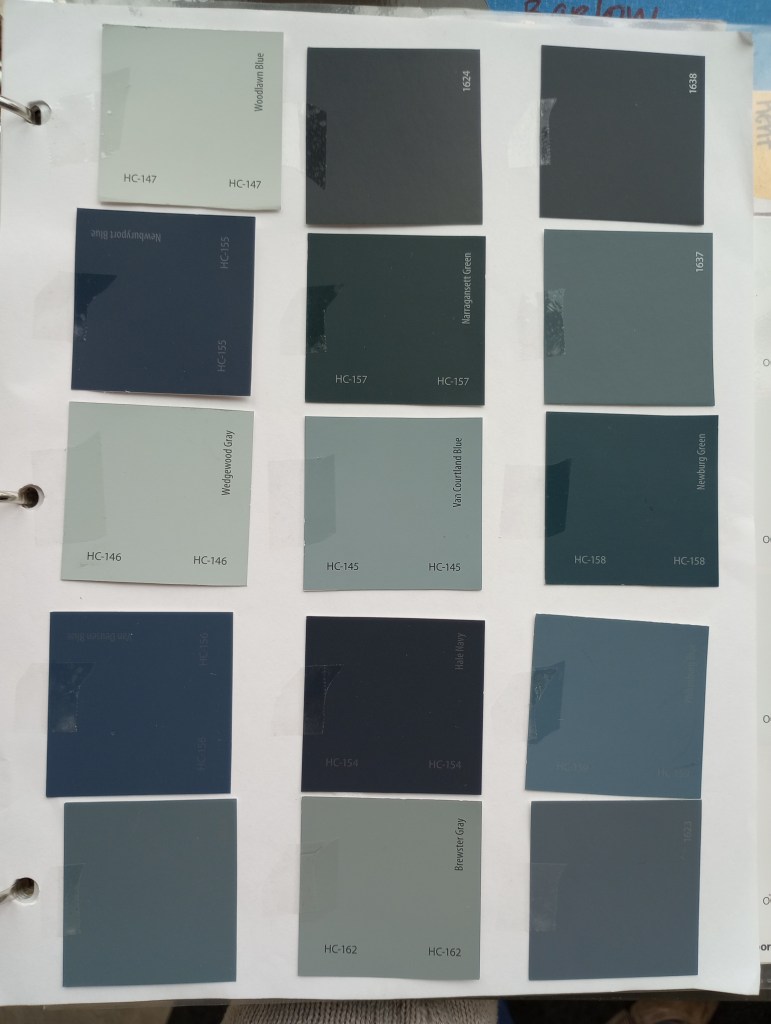
I kept narrowing down my favorite swatches. I would randomly take it out, walk outside and mark which ones I liked and which ones Alex liked. After a few days, I removed any that didn’t have any marks under them.
The final ones I wanted to get sample cans of were: Providence Blue, Brittania Blue and Blue Spruce.
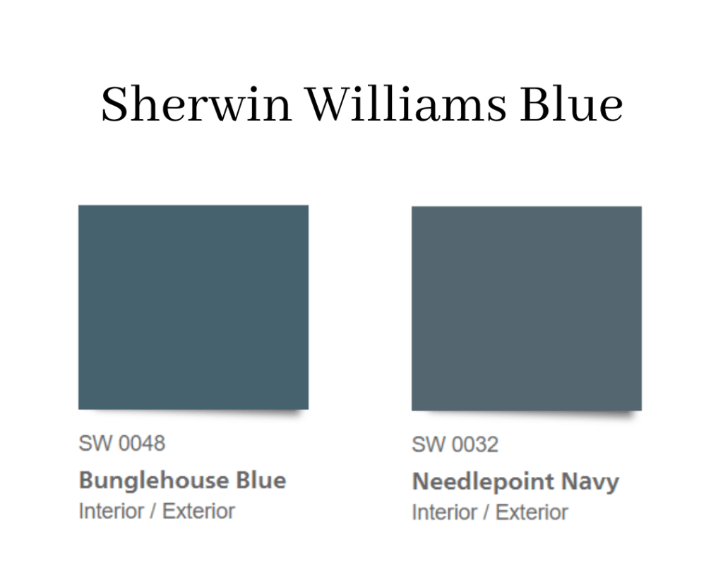
Alex then remember we will be ordering the paint through Sherwin Williams… My first thought was back to the drawing board! But my work was not in vain because we had in fact narrowed down the color we wanted to a medium-dark blue that leans gray. I was able to quickly pick out a few paper swatches at Sherwin Williams.
Curveball
So I was working on picking an exterior color in February. We landed on Needlepoint Navy with white trim and I thought it was a done deal. Fastforward to the last week of March. It was time to order the paint and Alex said we are doing this color and the owners didn’t like it. They just then decided we needed to pick a medium green, dark trim and light shakes. Uh, what?
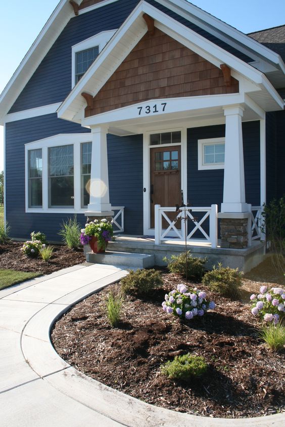
Poor Alex, he called me and said, “Don’t have a panic attack but he doesn’t want to do that blue. He wants medium green, dark trim and light shakes.” I was stunned and frustrated. Nothing against green. Nothing against dark trim. I think that can look great on the right house. Dark trim looks great on dark windows.
Gorgeous example of what I am saying.

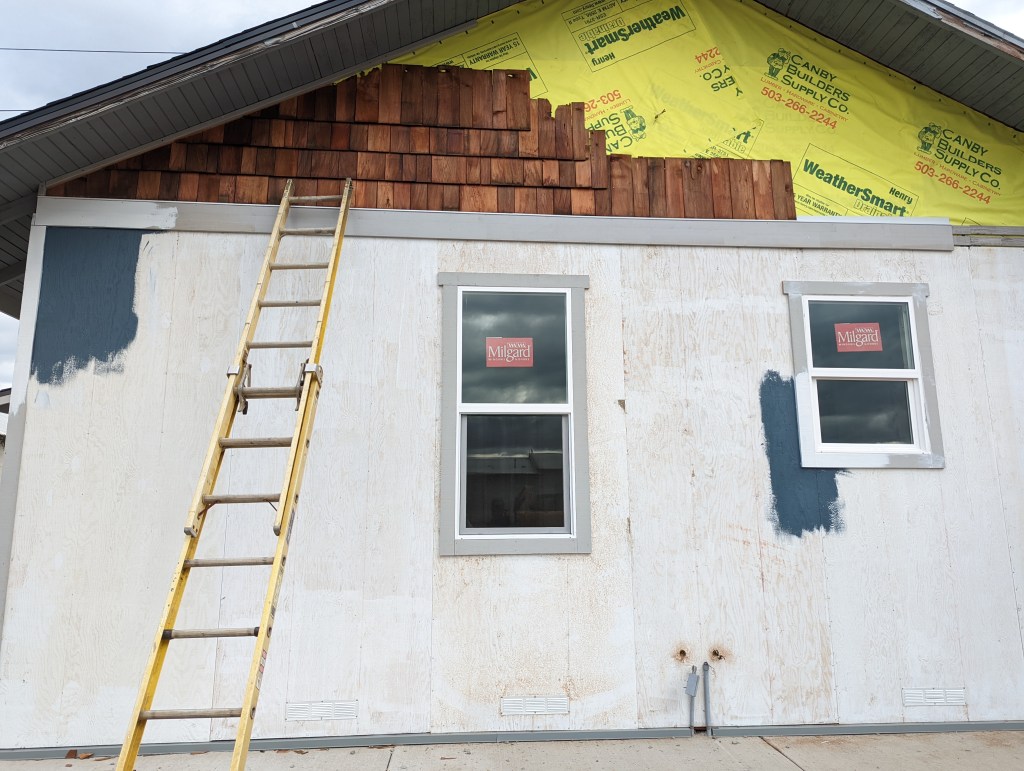
The new windows in Barlow Blue are white and would not come across the same. I want to maximize this house and make it look the best we can. I think a slightly darker green with white trim would look great. But before I spend hours picking a green color Alex came up with an idea. He would buy a can of the Needlepoint Navy and Extra White and paint it on a section of the house. And then the owner can decide if they really do want to pursue green.
Also – I had no idea there were going to be shakes above the board and batten siding. Gorgeous cedar shakes – painted! Please no! I think there has been a change of heart to keep those natural which would look great with the blue or green and some white trim.
Example of blue house with white trim and cedar shakes:
Now What?
So do you feel my emotional roller coaster when it comes to this house? Ha! As of right now, we are waiting to see if we can proceed with the Needlepoint Navy and white trim. Crossing all my fingers and toes!
Leave a Reply